Social Perfection

Octopi Smart Solutions – Brand Identity Rollout

01.

Intro of case

Following a strategic repositioning, Daisy Business Solutions sought to launch Octopi Smart Solutions as a distinct, forward-facing brand in the smart energy and tech sector. The challenge was not just to design a new look and feel — but to build a cohesive, credible identity that would signal innovation, trust and independence from the legacy brand, while remaining practical for deployment across a wide array of corporate and operational touchpoints.

Why this was important:
Clarity: A strong, differentiated identity was essential to communicate Octopi's focus on smart solutions -- separate from Daisy's print and office legacy.
Versatility: The brand needed to translate seamlessly across mediums -- from digital documents to fleet branding.
Confidence: Internally and externally, the rebrand needed to instil a sense of momentum and purpose for both clients and staff.
Banner featuring a green octopus logo and text "Octopi Smart Solutions: Smart Solutions for Your Business," alongside a black deck chair with the same branding. Iconography above suggests technology and innovation.

02.

Solution

Social Perfection led the full brand identity development, ensuring cohesion across every branded element — from high-level design principles to the smallest practical assets.

• Developed a distinct visual identity, including logo, colour palette, typography and iconography -- balancing modernity with technical credibility.
• Designed key stationery and communication assets: business cards, email signatures, letterheads and document templates.
• Created branded name tags, form templates and ad hoc internal-use assets to enable seamless brand adoption from day one.
• Delivered impactful fleet branding designs to take the identity onto the road -- literally driving visibility and recognition.
• Provided usage guidelines and flexible assets for ongoing marketing and operational needs.

03.

Main result

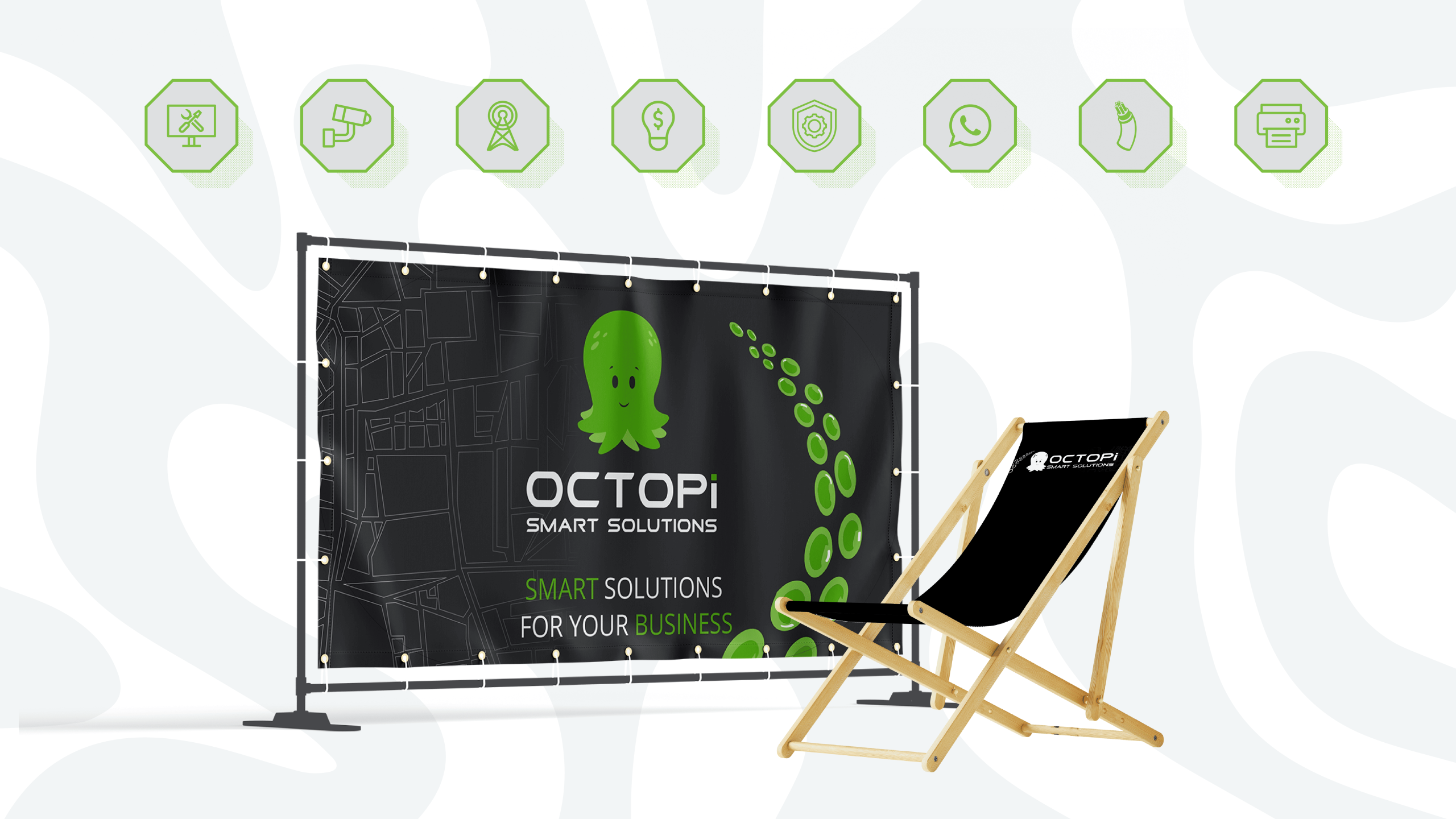
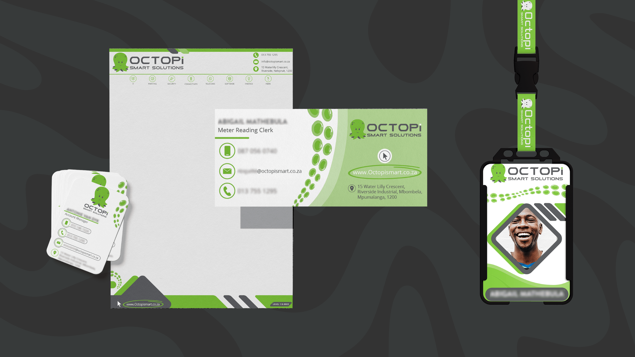
Octopi Smart Solutions launched with a sharp, integrated identity that positioned the brand as a credible player in the smart solutions space. The rollout empowered teams to embrace the new brand confidently, while clients immediately responded to the fresh, focused aesthetic. The identity system provided clarity, consistency and a strong visual foundation for future campaigns.

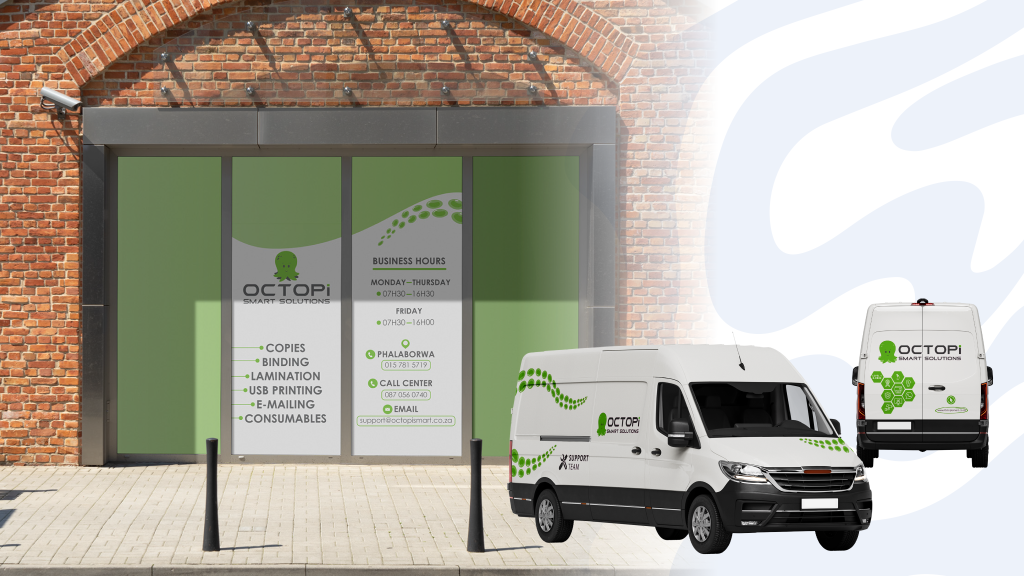
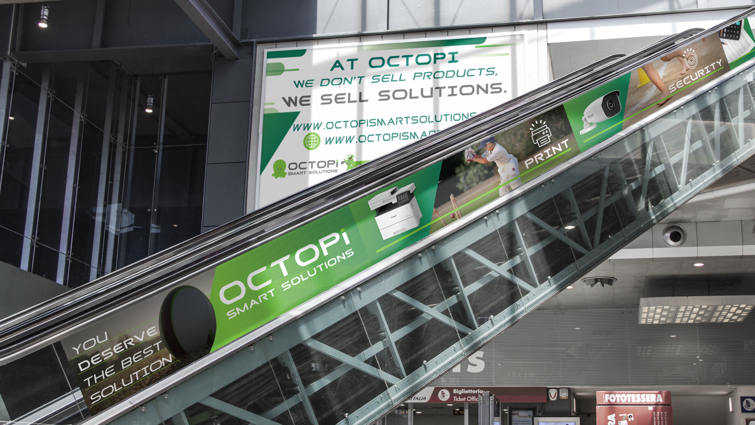
Fleet and field visibility improved dramatically post-launch, boosting brand recognition in key territories. Internal teams praised the functional, professional feel — with assets designed to be easily implemented across departments.

A set of branded materials for 'Octopi Smart Solutions,' featuring stationery, business cards, and an ID badge with a smiling person. The design uses green, black, and white colours with an octopus logo, conveying a tech-savvy and approachable tone.
Brick building with large windows featuring Octopi business signage and services. Two white delivery vans with Octopi branding parked nearby.
Escalator with advertising panels for OCTOPI Smart Solutions, featuring images of security cameras and printers. Banner above reads: 'We don't sell products, we sell solutions.' Modern, tech-focused tone.

Let’s discuss your project now!

Contact us to give life to awesome ideas or make suggestions on improvements to be made.


    *** Your email address will not be published.

    Cart (0 items)